티스토리 뷰

Vue.js(이하 Vue)는 간편하게 웹 애플리케이션을 만들 수 있는 프론트엔드 프레임워크입니다. Vue를 사용하는 사람들 사이에선 인기가 높은 프레임워크이지만, 아무래도 React에 비해 인지도 및 사용자 수에서 많이 뒤떨어지는 것이 사실입니다.
D3.js(이하 D3)는 'Data-Driven Document'의 약어로써(DDD -> D3), 웹 브라우저상에 여러 데이터 시각화 기능을 제공하는 자바스크립트 라이브러리입니다. 데이터 시각화 라이브러리는 다른 여러 가지가 있지만, 높은 자유도를 바탕으로 여러 신기한 차트를 표현할 수 있는 라이브러리는 D3 외에는 없습니다. 다만, 비교적 저수준의 기능을 다루기에 러닝 커브가 있는 편이고 적극적으로 사용하는 사용자가 많다고 하기는 힘든 실정입니다.
이렇게 비교적 마이너한 기술인 Vue와 D3를 함께 사용하려 할 때 참고할 자료가 적어 어려움이 있을 것이라 예상합니다. 대형 서점에서 검색해도 Vue와 D3를 함께 사용하는 예제가 포함된 도서는 한 손으로 충분히 꼽을 수 있는 정도인데요. 제가 겪었던 이런 어려움을 다른 분들은 조금이나마 덜 겪기를 바라며, Vue와 D3를 실제로 업무에 적용해 본 경험을 두 편의 글을 통해 샘플 대시보드를 만들어보면서 공유하고자 합니다.
Vue.js와 D3.js를 사용하여 대시보드 만들기 Part1
- 데이터 및 시각화 시나리오 소개
- 프로젝트 구성
- 라인차트 그리기
Vue.js와 D3.js를 사용하여 대시보드 만들기 Part2(예정)
- 막대 차트 그리기
- 파이 차트 그리기
- 프로젝트 마무리
데이터 및 시각화 시나리오 소개
시각화 데이터는 2000년부터 2022년까지의 대한민국 인구 통계 데이터를 Kaggle에서 다운받아 사용하겠습니다.(출처) 데이터에는 23년간 대한민국의 출생자수, 사망자수, 혼인건수, 이혼건수 등의 수치와 출생률, 사망률, 혼인률, 이혼율 등의 통계값이 존재합니다. 데이터의 Birth_rate(이하 출생률)는 뉴스에서 자주 이야기하는 합계출산률1과 다른 통계량인 조출생률2을 의미함을 유의해주시기 바랍니다. 아래는 데이터의 일부입니다.
| Date | Region | Birth | Birth_rate | Death | Divorce | Marriage |
| 6/1/2022 | Sejon | 248 | 7.9 | 106 | 43 | 123 |
| 6/1/2022 | Seoul | 3137 | 4.1 | 3631 | 1088 | 2630 |
| 6/1/2022 | Ulsan | 443 | 4.8 | 434 | 154 | 316 |
| 6/1/2022 | Jeollanam-do | 565 | 3.8 | 1369 | 299 | 479 |
| 6/1/2022 | Whole country | 18830 | 4.5 | 24850 | 7586 | 14898 |
프로젝트 구성
실습에서는 vite를 이용해 프로젝트를 생성하였고, npm init vue@latest 커맨드를 실행 후 아래 화면처럼 설정하였습니다. 각자의 취향에 맞추어 프로젝트 설정은 조금 상이해도 괜찮습니다. Vue 프로젝트 구성은 여기을 참고 하였습니다. 설치한 패키지는 vue, d3, bootstrap, axios입니다. 프로젝트의 자세한 패키지 정보는 여기을 확인하시기 바랍니다. 또한 D3 라이브러리는 버전이 달라질 때마다 변경이 많기로 악명(?)이 높습니다. 이번 프로젝트에서는 7.8.5 버전을 사용하였음을 말씀드립니다.
Vue 화면 구성
대시보드는 크게 두 영역으로 나뉩니다. 차트로 확인할 조건을 선택하는 영역과 조건에 따라 데이터를 보여줄 차트 영역으로 나뉩니다. 차트 영역은 라인 차트, 막대 차트, 파이 차트 세 가지 종류의 차트가 존재합니다. 라인 차트는 상단에서 사용자가 선택한 지역들을 대상으로 출생률의 시계열 추세를 보여줍니다. 막대 차트는 사용자가 출생아수, 사망자수, 혼인건수, 이혼건수 중 하나의 카테고리를 선택하면 전체 지역을 대상으로 해당 카테고리의 데이터를 보여줍니다. 파이 차트도 마찬가지로 사용자가 선택한 카테고리를 대상으로 상위 5개 지역에서의 비율을 나타내게 됩니다.
샘플 데이터 조회용 API 서버 구성
우리가 DB의 데이터를 이용해서 동적 대시보드를 개발한다면, DB로부터 데이터를 조회하는 API를 만들어 화면에서 호출하도록 할 것입니다. 하지만 이번 실습을 위해 API 서버까지 개발하는 것은 너무 번거롭기에 json-server를 이용하겠습니다. json-server는 특정한 포맷에 맞추어 json 파일을 생성하면 특별한 개발이 필요없이 바로 REST API를 이용할 수 있습니다. 이를 위해 위 csv 데이터를 아래와 같은 형식으로 변경하였고, 이곳에서 확인해볼 수 있습니다.
// json 데이터 예시
{
   "getBirthRates":[
      {
         "date":"1/1/2000",
         "region":"Busan",
         "birth_rate":11.61
      },
      {
         "date":"1/1/2000",
         "region":"Daegu",
         "birth_rate":14.39
      },
      {
         "date":"1/1/2000",
         "region":"Daejeon",
         "birth_rate":16.08
      },
      {
         "date":"1/1/2000",
         "region":"Gangwon-do",
         "birth_rate":14.91
      },
      ...
   ],
   "getDemographicValues":[
      {
         "region":"Busan",
         "type":"Birth",
         "value":1125
      },
      {
         "region":"Busan",
         "type":"Death",
         "value":1793
      },
      {
         "region":"Busan",
         "type":"Divorce",
         "value":507
      },
      {
         "region":"Busan",
         "type":"Marriage",
         "value":922
      },
      ...
   ]
}
json-server 설치 후, 위의 json 데이터 경로를 바라보도록 json-server를 구동합니다. json-server는 특별히 설정한 것이 없다면 3000 포트로 구동되며, json 파일의 데이터를 읽어 /getBirthRates, /getDemographicValues 경로의 두 API를 제공합니다.
// json-server 설치
npm install -g json-server
// json-server 실행
json-server --watch data/db.json

http://localhost:3000/getBirthRates?region={지역} (특정 지역의 출생률 시계열 데이터 조회)
http://localhost:3000/getDemographicValues?type={카테고리} (최근년도 기준 모든 지역의 특정 카테고리 데이터 조회)
프론트엔드에서 json-server를 호출하는 코드는 아래와 같습니다.
// services/index.ts
import axios from 'axios'

// api calls
export interface BirthRate {
  date: string
  region: string
  birth_rate: number
}

export interface DemographicValue {
  region: string
  type: 'Birth' | 'Death' | 'Divorce' | 'Marriage'
  value: number
}

const axiosClient = axios.create({
  baseURL: 'http://localhost:3000'
})

const getBirthRatesByRegion = async <T = BirthRate[]>(region: String): Promise<T> => {
  const { data } = await axiosClient.get<T>(`/getBirthRates?region=${region}`)
  return data
}

export const getBirthRates = (regions: String[]): Promise<BirthRate[][]> => {
  return Promise.all(regions.map((region) => getBirthRatesByRegion(region)))
}

export const getDemographicValues = async <T = DemographicValue[]>(type: String) => {
  const { data } = await axiosClient.get<T>(`/getDemographicValues?type=${type}`)
  return data
}
데이터 흐름
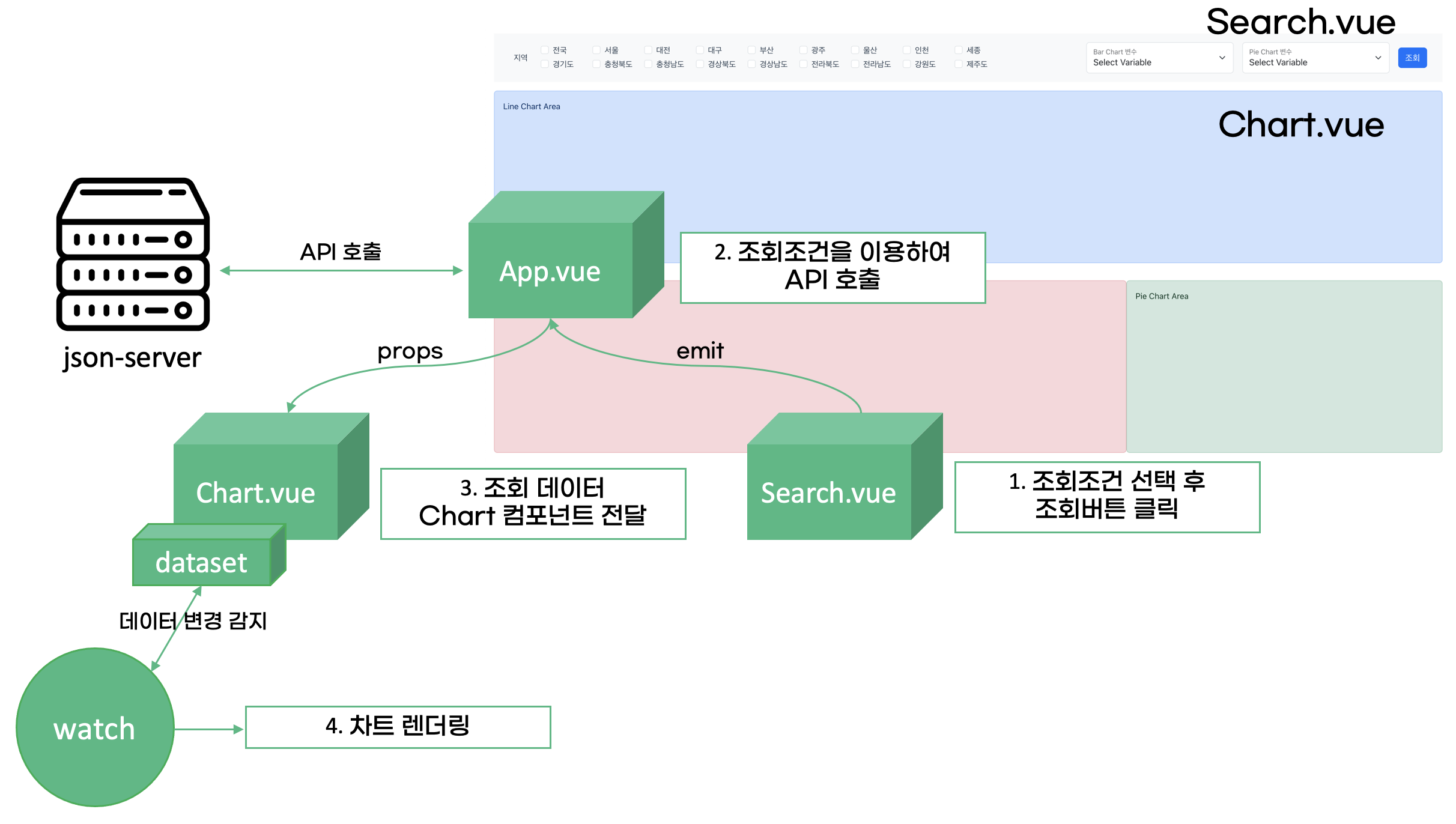
사용자가 조건을 선택하고 조회 버튼을 누르면 이에 따라 어떻게 차트가 업데이트되는지 흐름을 알아보도록 하겠습니다. 이 글의 독자는 Vue의 기본을 안다는 가정 하에 앞으로 사용할 Vue의 속성 및 기능 자체에 대한 설명은 생략하겠습니다. 사용자가 원하는 지역 및 카테고리를 Search 컴포넌트에서 선택하여 조회 버튼을 누르면 클릭 event가 최상위 App 컴포넌트로 emit되어 앞서 설정한 json-server로 필요한 API 요청을 보내게 됩니다. App에서는 조회된 데이터를 props로 Chart 컴포넌트에 bind하며, Chart 컴포넌트에서는 Composition API의 watch 함수를 사용하여 데이터가 변경될 때마다 차트를 렌더링하는 함수를 호출합니다. 아래의 vue 코드를 보시어 대략적인 흐름을 확인하시기 바랍니다.
// Chart.vue
<template>
  <div>
    <svg></svg>
  </div>
</template>

<script setup lang="ts">
defineProps({
  dataset: Array
})

watch(
  () => props.dataset,
  () => {
   draw()
  }
)
</script>
앞으로 진행할 프로젝트는 github에서 확인하실 수 있고, initial-setting tag로 체크아웃하시어 초기 설정이 완료된 상태로 작업하실 수 있습니다.
라인 차트 그리기
이제 첫번째 차트로 출생률 시계열 자료를 이용해 라인 차트를 그려보겠습니다. 세 파트로 나누어 진행할 것인데요. 먼저 하나의 지역에 대해 라인 차트를 그려보고, 다음은 여러 지역에 대해 그려보겠습니다. 마지막으로 여러 개선 사항을 적용하여 차트를 보기 좋게 만들어보겠습니다.
하나의 지역 대상
d3는 기본적으로 dimension을 잡고, scale과 axis를 선언하고, 이를 이용해 차트 영역을 정의한 후, 데이터를 입력해 차트를 그리는 과정으로 이루어집니다.
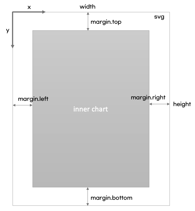
먼저 width, height, margin 등의 dimension을 보기 좋도록 선언한 후 svg 태그에 bind하겠습니다.
// LineChart.vue
<template>
  <div>
    <svg :width="width" :height="height"></svg>
  </div>
</template>

<script setup lang="ts">
defineProps({
  dataset: Array
})

const width = 1500
const height = 300
const margin = {top: 10, right: 20, bottom: 30, left: 20}
</script>
Scale을 정의하겠습니다. Scale(척도)이란 입력하는 데이터(domain, 정의역)에서 그래프로 출력되는 범위(range, 치역)로 매핑되는 함수를 의미합니다. d3에서 제공하는 scaleLinear, scaleUtc 등의 함수를 이용할 수 있습니다.
Scale은 x축, y축에 대해 모두 선언해야 하는데요. 먼저, x축에 대한 scale을 만들어보겠습니다. 시계열 자료이기 때문에 x축은 시간을 나타냅니다. 데이터를 보면 1/1/2000, 2/1/2000, ..., 6/1/2022 까지 23년 간 매월 1일을 나타내고 있는데요. 이렇게 날짜를 그래프의 축으로 매핑할 때 d3에서 제공하는 scaleUtc 함수를 사용할 수 있습니다.
y축의 경우 출생률을 나타내고, 이런 경우 선형 척도를 쓰면 되겠습니다. 출생률의 최대값을 먼저 구한 후, range의 범위를 0부터 최댓값 + 2.0으로 지정합니다.
// x Scale 선언
const x = d3.scaleUtc()
            // d3.extent에 데이터와 axis에 사용할 값을 읽어오는 함수를 입력하면 자동으로 domain이 계산됩니다
            .domain(d3.extent(chartData, d => new Date(d.date)))
            .range([margin.left, width - margin.right])

// birth rate 최대값
const maxRate = props.dataset?.map(
      arr => Math.max(...arr.map(o => o.birth_rate))
    ).reduce((prev, current) => (prev && prev > current) ? prev : current)

// y Scale 선언
const y = d3.scaleLinear()
            .domain([0, maxRate + 2.0]) // 2.0만큼의 여유를 두어 그래프가 보기 좋도록 합니다
            .range([height - margin.bottom, margin.top])
이제 앞서 정의한 x scale, y scale을 이용해 x, y 축을 정의합니다. width, height, margin을 이용하여 축의 위치를 조정하고, tick과 label을 함께 선언합니다.
// x axis
svg.append("g")
    .attr("transform", `translate(0,${height - margin.bottom})`) // x축의 위치를 y축 방향으로 height - margin.bottom만큼 이동해 x 축이 아래에 자리잡도록 합니다
    .call(
      d3
        .axisBottom(x)     // tick의 눈금이 아래 방향을 향하도록 합니다
        .ticks(width / 80) // x축에 width/80 만큼의 tick을 정의합니다
    )

// y axis
svg.append("g")
    attr("transform", `translate(${margin.left},0)`)
    .call(
      d3
        .axisLeft(y)
        .ticks(height / 40)
    )
    .call(g => g.select(".domain").remove())
    .call(g => g.selectAll(".tick line").clone()
        .attr("x2", width - margin.left - margin.right)
        .attr("stroke-opacity", 0.1))
    .call(g => g.append("text")
        .attr("x", -margin.left)
        .attr("y", 10)
        .attr("fill", "currentColor")
        .attr("text-anchor", "start")
        .text("Birth Rate(%)") // y축 상단에 label을 붙입니다.
    )
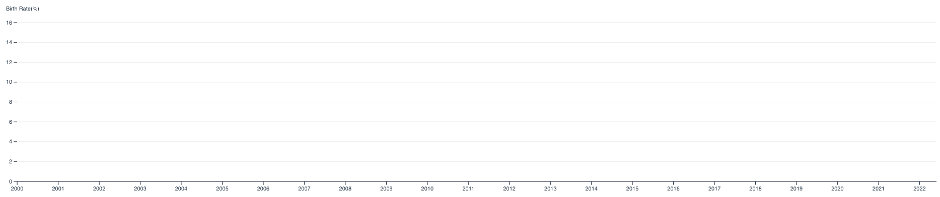
이제 척도(scale)와 축(axes)을 정의하여 svg에 append하였으니 차트를 그리기 위한 준비가 끝났습니다. 여기까지의 코드로 실행해 보면 아래와 같이 빈 차트가 나오는 것을 볼 수 있습니다.
빈 차트 위에 데이터를 이용해 라인(path)을 그리겠습니다. 아래 코드를 참고하시면 되겠습니다.
// 데이터로부터 x값, y값을 구하는 함수를 정의해 line 함수를 생성합니다
const line= d3.line()
    .x(d => x(new Date(d.date)))
    .y(d => y(d.birth_rate))

svg.append("path") // line은 path 속성을 svg에 append하여 그릴 수 있습니다
    .attr("fill", "none")
    .attr("stroke", "steelblue")
    .attr("stroke-width", 1.5)
    // line 함수에 데이터를 입력하여 path 속성 아래 d 태그값으로 x, y값을 정의합니다
    .attr("d", line(chartData))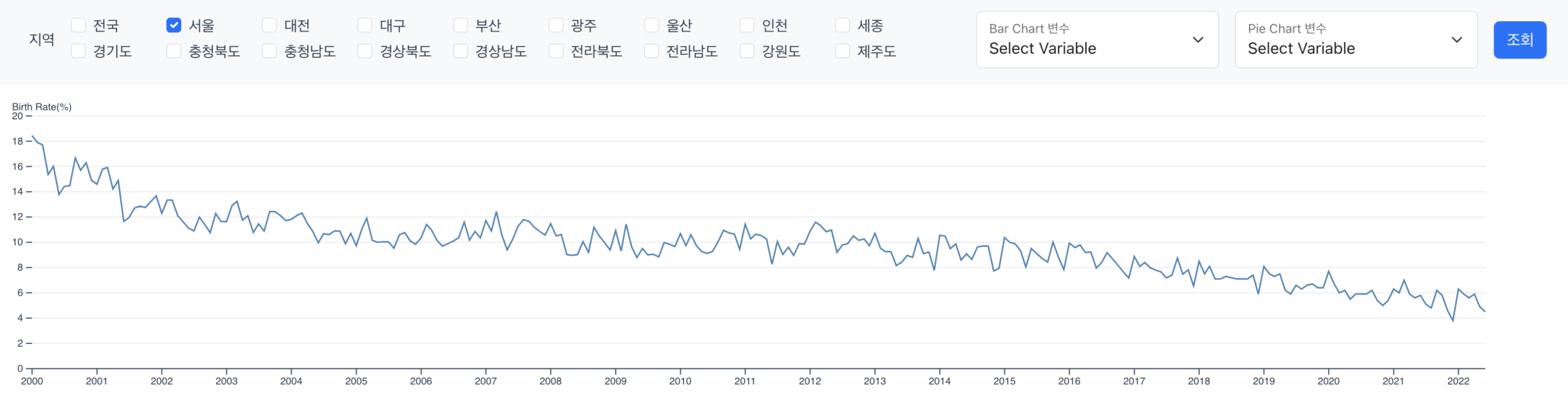
아래는 단일 지역에 대한 시계열 라인 차트를 그리는 전체 소스코드입니다. 여기까지 진행하면 단일 지역에 대한 라인 차트를 그릴 수 있습니다.
//LineChart.vue
<template>
  <div class="container-fluid py-3">
    <svg :width="width" :height="height"></svg>
  </div>
</template>

<script setup lang="ts">
import * as d3 from 'd3'
import { watch } from 'vue';

const props = defineProps({
  dataset: Array
})
// dimensions
const width = 1500
const height = 300
const margin = {top: 10, right: 20, bottom: 30, left: 20}

let chartData = []
let maxRate

// watch dataset
watch(
  () => props.dataset,
  () => {
    const svg = d3.select('svg')
    svg.selectAll("*").remove() // reset svg

    // preprocess props data
    maxRate = props.dataset?.map(
      arr => Math.max(...arr.map(o => o.birth_rate))
    ).reduce((prev, current) => (prev && prev > current) ? prev : current)
    console.log(`max Rate ${maxRate}`)

    chartData = props.dataset![0]

    // scales
    const x = d3.scaleUtc()
      .domain(d3.extent(chartData, d => new Date(d.date)))
      .range([margin.left, width - margin.right])

    const y = d3.scaleLinear()
      .domain([0, maxRate + 2.0])
      .range([height - margin.bottom, margin.top])

    // select svg container
    svg
      .attr('viewBox', [0, 0, width, height])

    // append axes
    // Add the x-axis.
    svg.append("g")
        .attr("transform", `translate(0,${height - margin.bottom})`)
        .call(d3.axisBottom(x).ticks(width / 80).tickSizeOuter(0))

    // Add the y-axis, remove the domain line, add grid lines and a label.
    svg.append("g")
        .attr("transform", `translate(${margin.left},0)`)
        .call(d3.axisLeft(y).ticks(height / 40))
        .call(g => g.select(".domain").remove())
        .call(g => g.selectAll(".tick line").clone()
            .attr("x2", width - margin.left - margin.right)
            .attr("stroke-opacity", 0.1))
        .call(g => g.append("text")
            .attr("x", -margin.left)
            .attr("y", 10)
            .attr("fill", "currentColor")
            .attr("text-anchor", "start")
            .text("Birth Rate(%)")
        )

    // Declare the line generator.
    const line = d3.line()
        .x(d => x(new Date(d.date)))
        .y(d => y(d.birth_rate))

    // Append a path for the line.
    svg.append("path")
        .attr("fill", "none")
        .attr("stroke", "steelblue")
        .attr("stroke-width", 1.5)
        .attr("d", line(chartData))
  }
)
</script>
여러 지역 대상
여러 지역을 차트로 나타내는 것은 어렵지 않습니다. 앞서 하나의 지역으로 차트를 그리는 코드를 모든 지역마다 실행하면 되는데요. 단, x, y축과 tick을 그리는 부분은 단 한 번만 호출해야 함을 주의하여 아래와 같이 수정합니다. 축을 그리는 부분을 drawAxes 함수로, 라인을 그리는 부분을 drawLine 함수로 추출합니다. 그 뒤 데이터 변경 시, drawAxes 함수를 호출하고, 각 지역마다 drawLine 함수를 수행합니다.
<template>
  <div class="container-fluid py-3">
    <svg :width="width" :height="height"></svg>
  </div>
</template>

<script setup lang="ts">
import * as d3 from 'd3'
import { watch } from 'vue'

const props = defineProps({
  dataset: Array
})
// dimensions
const width = 1500
const height = 300
const margin = { top: 10, right: 20, bottom: 30, left: 20 }

let svg: d3.Selection<SVGElement, {}, HTMLElement, any>, maxRate: number | undefined
let x: d3.ScaleTime<number, number, never>, y: d3.ScaleLinear<number, number, never>
// watch dataset
watch(
  () => props.dataset,
  () => {
    // reset svg and draw axes
    drawAxes()
    // draw lines for selected regions
    props.dataset!.map((data) => drawLine(data, x, y))
  }
)

const drawAxes = () => {
  // clear svg
  svg = d3.select('svg')
  svg.selectAll('*').remove()

  // preprocess props data
  maxRate = props.dataset
    ?.map((arr) => Math.max(...arr.map((o) => o.birth_rate)))
    .reduce((prev, current) => (prev && prev > current ? prev : current))

  // scales
  x = d3
    .scaleUtc()
    .domain(d3.extent(props.dataset![0], (d) => new Date(d.date)))
    .range([margin.left, width - margin.right])

  y = d3
    .scaleLinear()
    .domain([0, maxRate! + 2.0])
    .range([height - margin.bottom, margin.top])

  // select svg container
  svg.attr('viewBox', [0, 0, width, height])

  // append axes
  // Add the x-axis.
  svg
    .append('g')
    .attr('transform', `translate(0,${height - margin.bottom})`)
    .call(
      d3
        .axisBottom(x)
        .ticks(width / 80)
        .tickSizeOuter(0)
    )

  // Add the y-axis, remove the domain line, add grid lines and a label.
  svg
    .append('g')
    .attr('transform', `translate(${margin.left},0)`)
    .call(d3.axisLeft(y).ticks(height / 40))
    .call((g) => g.select('.domain').remove())
    .call((g) =>
      g
        .selectAll('.tick line')
        .clone()
        .attr('x2', width - margin.left - margin.right)
        .attr('stroke-opacity', 0.1)
    )
    .call((g) =>
      g
        .append('text')
        .attr('x', -margin.left)
        .attr('y', 10)
        .attr('fill', 'currentColor')
        .attr('text-anchor', 'start')
        .text('Birth Rate(%)')
    )
}

const drawLine = (
  chartData: BirthRate[],
  x: d3.ScaleTime<number, number, never>,
  y: d3.ScaleLinear<number, number, never>
) => {
  // Declare the line generator.
  const line = d3
    .line()
    .x((d) => x(new Date(d.date)))
    .y((d) => y(d.birth_rate ? d.birth_rate : 0)) // 세종의 경우 2012년까지 birth rate가 null

  // Append a path for the line.
  svg
    .append('path')
    .attr('fill', 'none')
    .attr('stroke', 'steelblue')
    .attr('stroke-width', 1.5)
    .attr('d', line(chartData))
}
</script>
하지만 문제가 하나 있습니다. 수정한 대로 여러 지역마다 라인 차트가 잘 그려지기는 하지만, 아래처럼 알아보기 힘든 차트가 되어버렸습니다. 이를 해결하기 위해 몇 가지 개선 사항을 고민해 보겠습니다.
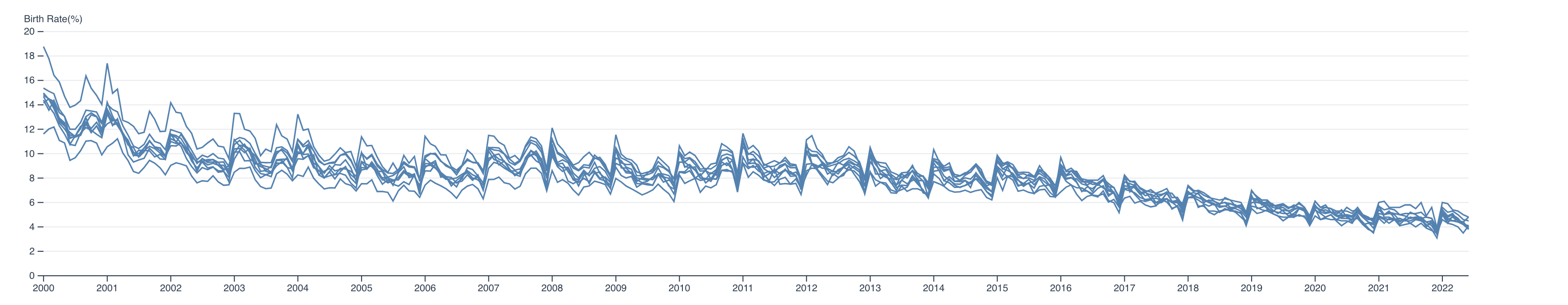
차트 개선사항 적용
제일 먼저 개선해야 할 사항은 모든 지역이 동일한 색상의 라인 차트를 그리고 있다는 점입니다. d3에서 제공하는 d3-scale-chromatic 모듈을 이용하여 간편하게 지역별로 다른 색상을 입혀보겠습니다. 지금처럼 categorical 변수의 경우 사용할 수 있는 여러 categorical 스키마가 존재하는데요. 이 중 하나를 골라 색상의 척도(colorScale)를 정의하겠습니다.
let colorScale: d3.ScaleOrdinal<string, string, never>

// 색상 척도를 생성합니다. domain에 카테고리(지역) 리스트를 입력하면 자동으로 각 카테고리별 색상 range를 mapping합니다.
colorScale = d3.scaleOrdinal(d3.schemeCategory10)
                .domain(props.dataset!.map((data) => data[0].region))

const drawLine = (
  chartData: BirthRate[],
  x: d3.ScaleTime<number, number, never>,
  y: d3.ScaleLinear<number, number, never>
) => {
  ...
  // Append a path for the line.
  svg
    .append('path')
    .attr('fill', 'none')
    // .attr('stroke', 'steelblue') // 모두 동일한 color(steelblue)를 사용하던 기존 방식
    .attr('stroke', colorScale(chartData[0].region)) // colorScale에 지역명을 넣어 'stroke' 태그로 지정해 지역마다 상이한 색상을 사용하도록 합니다
    .attr('stroke-width', 1.5)
    .attr('d', line(chartData))
}
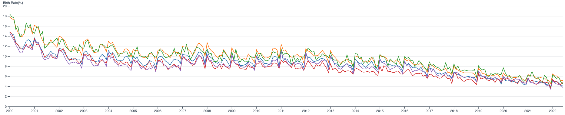
이제 지역마다 다른 색상의 라인이 그려집니다. 하지만 여전히 어느 라인이 어느 지역인지 알아보기 힘듭니다. 범례(legend)표를 붙여 이를 해결해 보겠습니다.
const addLegend = (legendX:number=1000) => {
    // legend
    const legend = svg.append("g")
      .attr("class", "legend")
      .attr("transform", `translate(${legendX}, 0)`) // legend 위치 조절

    legend.selectAll("rect") // 각 지역의 색상으로 조그만 사각형을 생성합니다
      .data(props.dataset!.map((data) => data[0].region))
      .enter()
      .append("rect")
        .attr("x", 0)
        .attr("y", (d, i) => i * 20)
        .attr("width", 10)
        .attr("height", 10)
        .style("fill", d => colorScale(d))

    legend.selectAll("text") // 사각형의 색상 범례옆에 지역명을 표시합니다
      .data(props.dataset!.map((data) => data[0].region))
      .enter().append("text")
        .attr("x", 15) // Position text next to the rectangle
        .attr("y", (d, i) => i * 20 + 9) // Align text with rectangles
      .text(d => d)
      .style("font-size", "12px")
        .attr("text-anchor", "start")
}
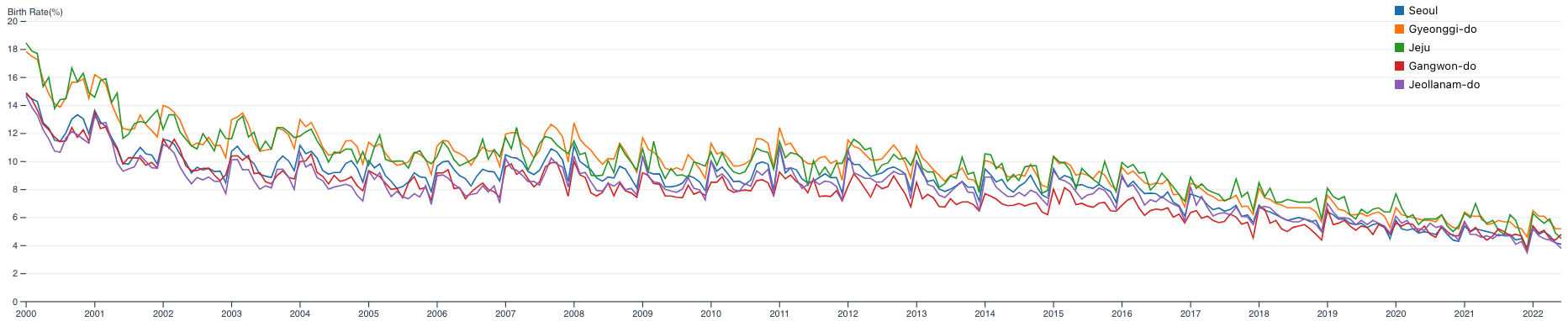
이제 각 라인의 색상이 어느 지역을 나타내는지 알 수 있습니다. 아직 한 가지 아쉬운 점은 그래프상에서 출생률 수치를 확인하기가 쉽지 않다는 점입니다. 툴팁(tooltip)을 만들어 특정 시점의 수치를 확인할 수 있으면 좋겠습니다.
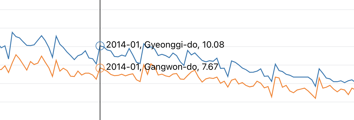
툴팁을 넣기 위해 마우스 이벤트를 생성해야 합니다. 코드가 꽤 복잡하지만 크게 나누어 생각하면 됩니다. 라인의 각 포인트마다 조그만 원(mouse-per-line circle)을 정의하고, 수직의 라인(mouse-line)도 정의합니다. 각 포인트마다 띄워줄 툴팁 메시지(mouse-per-line text)도 생성합니다. 이 세 가지가 마우스의 움직임에 따라 보이고(opacity 1) 안 보이도록(opacity 0) 하면 됩니다.
또한, 세 가지 이벤트를 정의해야 합니다. 마우스가 차트 영역에 들어올 때(mouseover), 차트 영역에서 나갈 때(mouseout), 차트 내부에서 마우스르 움직일 때(mousemove) 이벤트가 필요하며, 마우스가 움직일 때마다 mousemove에 정의한 이벤트 함수에서 마우스의 위치를 계산하여 하이라이트 라인과 툴팁 메시지를 생성하여 화면에 보여줍니다. 이번 파트의 코드는 이곳에서 참조하였습니다.
const addMouseEvent = () => {
    // circles for highlighting
    const circles = colorScale.domain().map(
      (name) => ({
        name,
        values: props.dataset!
                    .filter(x => x[0].region === name)[0]
                    .map((d:BirthRate) => ({
                      date: d.date,
                      rate: d.birth_rate
                    }))
      })
    )

    const mouseG = svg.append("g")
                      .attr("class", "mouse-over-effects") // mouse-over-effect class의 group을 생성

    mouseG.append("path") // black vertical line
          .attr("class", "mouse-line")
          .style("stroke", "black")
          .style("stroke-width", "1px")
          .style("opacity", "0")

    const lines = document.getElementsByClassName('line')

    const mousePerLine = mouseG.selectAll('.mouse-per-line')
                                .data(circles)
                                .enter()
                                .append("g")
                                .attr("class", "mouse-per-line")

    mousePerLine.append("circle")
                .attr("r", 7)
                .style("stroke", (d) => (colorScale(d.name)))
                .style("fill", "none")
                .style("stroke-width", "1px")
                .style("opacity", "0")

    mousePerLine.append("text")
                .attr("transform", "translate(10,3)")

    mouseG.append('svg:rect')
          .attr('width', width)
          .attr('height', height)
          .attr('fill', 'none')
          .attr('pointer-events', 'all')
          .on('mouseover', function() { // 마우스가 차트 영역으로 들어올 때 이벤트
            d3.select(".mouse-line")
              .style("opacity", "1") // opacity를 1로 설정하여 보이도록 합니다
            d3.selectAll(".mouse-per-line circle")
              .style("opacity", "1")
            d3.selectAll(".mouse-per-line text")
              .style("opacity", "1")
          })
          .on('mouseout', function() { // 마우스가 차트 영역에서 나갈 때 이벤트
            d3.select(".mouse-line")
              .style("opacity", "0") // opacity를 0으로 설정하여 보이지 않도록 합니다
            d3.selectAll(".mouse-per-line circle")
              .style("opacity", "0")
            d3.selectAll(".mouse-per-line text")
              .style("opacity", "0")
          })
          .on('mousemove', function() { // 마우스가 차트 영역에서 움직일 때 이벤트
            const mouse = d3.pointer(event)
            d3.select(".mouse-line")
              .attr("d", function() {
                let d = "M" + mouse[0] + "," + height
                d += " " + mouse[0] + "," + 0
                return d
              })
              d3.selectAll(".mouse-per-line")
                .attr("transform", function(d, i) {
                  const xDate = x.invert(mouse[0])
                  const bisect = d3.bisector((d) => (d.date)).right
                  const idx = bisect(d.values, xDate)

                  let beginning:number|null = 0
                  let end = (lines[i] as SVGGeometryElement).getTotalLength()
                  let target = null
                  let pos:DOMPoint

                  while (true){ // 차트 상에 툴팁을 보여줄 위치를 계산합니다
                    target = Math.floor((beginning + end) / 2)
                    pos = (lines[i] as SVGGeometryElement).getPointAtLength(target)
                    if ((target === end || target === beginning) && pos.x !== mouse[0])
                      break
                    if (pos.x > mouse[0])
                      end = target
                    else if (pos.x < mouse[0])
                      beginning = target
                    else
                      break
                  }

                  // 툴팁 메시지 포맷을 설정합니다
                  d3.select(this).select('text')
                    .text(`${formatDate(xDate)}, ${d.name}, ${ y.invert(pos.y).toFixed(2)}`)

                  return "translate(" + mouse[0] + "," + pos.y +")" // 툴팁이 띄워질 위치를 반환합니다
                })
          })
}

const formatDate = (date:string) => {
    const d = new Date(date)
    let month = '' + (d.getMonth() + 1)
    let year = d.getFullYear()
    if (month.length < 2)
        month = '0' + month;
    return [year, month].join('-');
}
이제 라인 차트가 완성되었습니다. 전체 코드는 이곳에서 확인할 수 있습니다. 다음 글에서는 우리가 선택한 카테고리에 따라 막대 차트와 파이 차트가 그려지도록 하고 프로젝트를 마무리토록 하겠습니다.
1 합계출산률 : 가임 여성 1명이 평생 동안 낳을 것으로 예상되는 평균 출생아 수, 2022년 기준 0.78
2 조출생률 : 인구 천명당 출생아 수
'Frontend' 카테고리의 다른 글
| 백엔드 개발자의 험난한 React 캘린더 컴포넌트 만들기 대작전 (feat. Props Drilling) (4) | 2024.01.31 |
|---|---|
| 개발자의 DIY: Github Pages로 나만의 모바일 초대장 제작하기 (0) | 2023.11.15 |
| Browser Fingerprint의 동작 원리와 운영시 예상되는 이슈 (0) | 2023.11.01 |
| 자바스크립트 Map 자료구조 적극 이용하기 (0) | 2023.03.08 |
| 기획전 a11y 개선 프로젝트 (0) | 2023.01.17 |